
I’ve complained previously about Hollywood’s absurd obsession with the colors teal and orange. This stupid fad is truly ruining the art of motion picture photography. Unfortunately, this ugly color scheme is the sort of thing that, once you notice it, you can’t stop noticing it everywhere you look, in almost every movie being made these days. The problem really hit home for me (literally hit home – I live in the city where this movie is set) with the recent Blu-ray release of ‘The Town‘, which is totally inundated with teal teal teal teal teal teal. It looks friggin’ ridiculous.
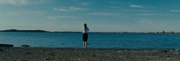
‘The Town’ is set in (and was shot in) Boston in the middle of winter. Despite this, an early scene shows the water in Boston Harbor as bright teal, like it’s the goddamn Caribbean or something. I realize that movies are not real life, and artistic license gives filmmakers the right to make their movies look like whatever they want. Even so, this looks nothing like Boston, and frankly just looks stupid. I can think of no artistic reason why the filmmakers thought this would be a good idea.
In his audio commentary, writer/director/star Ben Affleck mentions giving the movie a bluish cast to make everything look cold. Except that, there’s really very little blue in the movie’s photography. It’s almost all teal. Has a blight of colorblindness struck everyone in Hollywood?
Director of Photography Robert Elswit has an Oscar for shooting ‘There Will Be Blood‘. Yet here he is, making a movie look just like every other damn movie that comes out of Hollywood these days. I’m dumbstruck with disappointment.
Here are some more screenshots taken from random scenes throughout the movie to demonstrate how teal teal teal it is. Keep in mind that these frames were grabbed from the accompanying DVD disc. The more vibrant colors on the Blu-ray really exaggerate the effect. Also, the colors on my computer monitor are not as accurate as those on my calibrated home theater screen, and I suspect that’s a common issue. Take my word for it that it looks even worse during normal playback.


We’re in a new decade now. Can people in Hollywood please start using a different color scheme from now on? This one has outlived its usefulness. That would be great. Thanks.


hurin
Thanks for the warning, I had thought of renting this one, now I won’t.
William Henley
You are right, these colors are everywhere! Like, I swear your profile picture is bathed in orange and the background of the blog is bathed in teal! 🙂
Sorry, I just feel like being confrontational today! 🙂
Josh Zyber
AuthorOh, I know you’re right about my profile pic. That photo was taken at Blu-Con. Most of the slides projected on the screen behind the stage were quite teal (ironic for an event called Blu-Con), and the lighting in the room made everyone’s face show up as deep orange when photographed. If you can believe it, I actually dialed back the colors in Photoshop before using that picture.
(If anyone else is wondering what the hell we’re talking about, the photos are found in the following post: http://www.highdefdigest.com/blog/pics-blucon/ )
As for the blog here, the background should be straight-up blue, unless your monitor is skewing the colors.
William Henley
Eh, the background is bluish. I think its just this crappy work monitor I have. I have a good monitor on my PC at home, but that computer is rarely used for surfing.
Its actually kind of a baby-blue on my screen. It is annoyingly the same color as the default firefox theme that my workplace has installed. I’m going to go download a theme!
BostonMA
“mentions giving the movie a bluish cast to make everything look cold”
funny, another thing Affleck attempted to rip off of Heat.
Lone_gunmen
It’s weird because i barely noticed Teal and Orange when i viewed it at the cinema. Perhaps the blu-ray has been tweaked?