
These days in the home theater world, it seems like everything is 4k this or 4k that. If it isn’t 4k, or doesn’t at least come from a 4k source, it must be garbage. Anyone can see that 4 is a higher number than 2, so logically 4k must always be better than 2k. Except when it isn’t. Technical specs only tell part of the story.
John Carpenter’s horror classic ‘The Thing’ is a popular home video staple that’s already had a couple of Blu-ray releases in the United States. Last year’s Collector’s Edition copy from Scream Factory received high marks from Shannon in his Blu-ray review. Nonetheless, some fans were put off by the published specs, which indicated that the video transfer derived from a 2k scan of the film’s interpositive. That source is at least one generation away from the original camera negative, and who even still does anything in 2k anymore? No matter how good it may have looked, surely it wasn’t good enough.
Meanwhile, Arrow Video in the UK announced its own restoration effort, which would come from a new 4k scan of the camera negative, supervised by both director John Carpenter and cinematographer Dean Cundey. Arrow has a pretty strong reputation as being something of a Criterion equivalent for cult movies, and everything about this project sounded like it ought to be the end-all/be-all definitive Blu-ray edition of ‘The Thing’ (at least, until Ultra HD, but that doesn’t seem to be on the docket anytime soon).
Arrow’s Limited Edition Blu-ray was released last week in two packaging variations – either a box set packed with physical bric-a-brac or a SteelBook. Anticipation for this release was so high that both sold out well in advance, but a Special Edition with the same disc in a keepcase will be released on November 20th. I ordered the SteelBook and received it late last week, good timing for a pre-Halloween viewing.
Due to distribution rights issues, the Arrow disc is locked to Region B. An American viewer will need a region-free Blu-ray player to watch it. The booklet included with the Blu-ray contains the following text regarding the video transfer:
The Thing has been exclusively restored for this release by Arrow Films. The film is presented in its original theatrical aspect ratio of 2.35:1. The audio is presented in a 4.1 mix from original Dolby 6-Track Dolby Stereo mix (DTS-HD), a 5.1 mix (DTS-HD) and in a 2.0 stereo mix (DTS-HD). All materials for this restoration were made available by NBC Universal.
The original 35mm camera negative was scanned in 4K resolution on a pin-registered Arriscan at NBC Universal Studio Post, Universal City, CA.
Primary grading and picture restoration was completed at Silver Salt Restoration in London.
Director John Carpenter and director of photography Dean Cundey supervised and approved final grading at Deluxe, Culver City.
Audio mixes were produced and delivered by NBC Universal.
Restoration supervised by James White/Arrow Films.
Silver Salt Restoration: Mark Bonnici, Stephen Bearman, Anthony Badger
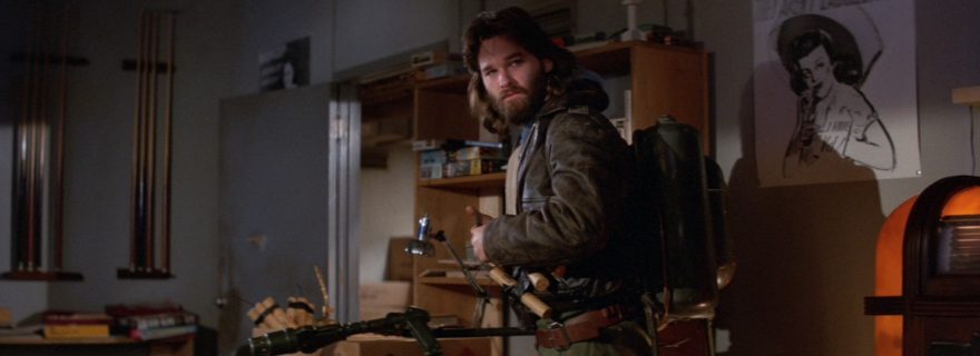
That sounds great, doesn’t it? With all that work and those credentials behind it, I sat down expecting to be blown away. Although the movie looks decent for the most part, nothing about it struck me as particularly stunning or revelatory. In fact, the image quality is pretty soft most of the time. At first, I questioned whether perhaps that was just the nature of the film’s original photography. However, a quick look at the screencaps Shannon included in his review of the Scream Factory disc put that notion to rest pretty quickly. I took my own screencaps matching his as closely as I could. (The last one was provided by one of our other reviewers, E.)
Expand these to full size in your browser window and you can see that in every instance, the Scream Factory disc is sharper and more detailed, sometimes dramatically more. Colors are also cleaner and better resolved.
")
![]()
")
![]()
")
![]()
")
![]()
")
![]()
(It’s also worth noting that, despite both transfers claiming supervision and approval by Dean Cundey with barely a year between them, their color grading looks quite different. This really puts the legitimacy of the controversial ‘Halloween: 35th Anniversary Edition‘ Blu-ray into question. My honest feeling here is that every time the guy supervises a video transfer for one of his old movies, he grades it however he feels looks best at the time, without much concern for referencing how the film looked when he originally photographed it.)
Even having just watched the movie, I went out to Best Buy and picked up the Scream Factory Collector’s Edition this weekend. Comparing several scenes, it’s obvious that the Scream Factory Blu-ray has more genuine picture detail all throughout the movie in practically every shot. The difference between the discs looks like one is being projected in tight focus while the other is slightly out of focus. The tradeoff to this is that grain is also more prominent (and it’s a pretty grainy movie). Even so, the benefits outweigh the negatives, and the sharper, clearer image is a lot more appealing and satisfying in the majority of scenes.
Viewed on its own at regular playback speed (rather than obsessing over individual screencaps), the Arrow disc is watchable enough. Some scenes look better than others, but I was never taken out of the movie by lousy picture quality. If I didn’t have anything better to compare it against, I’d think it was perfectly adequate. Nevertheless, the softness is a disappointment when it’s clear that the original photography had a lot more detail available on the film elements that this transfer is simply not picking up or taking advantage of.
How can this be?! The Arrow disc has a 4k scan of the original negative! It has to look better, doesn’t it?
Some possible explanations: The 4k scanner used for this master may have been inferior to the 2k scanner used for Scream Factory’s master. Arrow may have applied Digital Noise Reduction to the transfer after scanning. Softening may have occurred during the downconversion from 4k to 1080p. Perhaps the video was overcompressed in order to squeeze several hours of high-def bonus features onto the same disc. Any or all of these could be responsible.
Whatever the cause, Arrow Video’s Limited Edition of ‘The Thing’ has failed to live up to its promise and hype. The main selling points of the disc are now its exclusive bonus features. Though the Scream Factory disc was no slouch in that area, Arrow has several different documentaries and featurettes. Die-hard fans with region-free capability will probably want to own both copies. Those just looking for the best a/v presentation should stick with Scream Factory’s offering, regardless of its 2k source. This is just another example of how obsessing over technical specs can so frequently lead to the wrong conclusion.
I plan to make the Scream Factory disc my default for viewing this movie going forward… Until somebody does an 8k scan, of course. Because that would have to be amazing, right?


Csm101
I’m no expert on any of these matters, but I’ve read a lot of people claiming that the Scream version is over sharpened. There are pages and pages of debates over all this on the bluray forums. To me it looks fine, but do you think there was any of that? I’m still really curious and eager to be able to see the Arrow version for myself in motion.
Josh Zyber
AuthorAre you sure those weren’t complaints about the earlier Blu-ray from Universal? That disc definitely had edge enhancement problems.
The Scream disc may have a smidge of sharpening, but I didn’t see anything objectionable in the scenes I sampled. (I did not rewatch the entire movie again.) However, it also clearly has more real picture detail that simply isn’t present in the Arrow transfer. Look at the difference in the dog’s fur, or Kurt Russell’s hair and beard. The Arrow disc practically looks out of focus in comparison.
William Henley
I haven’t seen this movie myself, but CSM’s comment makes a good point. There are several movies I have that tout new scans, but tend to look soft to earlier versions I have seen. Looking at these closer, it seems that the distributor elected for a “clean” image, that is, retaining what the original film looks like, but removing blemishes like dirt and scratches. Many of us are actually pretty use to having a sharpened picture without realizing it – usually a studio applies SOME sharpening or edge enhancement. Truthfully, most people don’t notice it unless the levels are set too high, which produces artifacts, halos and ringing, banding, and sometimes weird color splotches.
From the look of the screenshots, I don’t think the Arrow release had any noise reduction done – rather the lower grain seems to be a result of being from the negative. Every time you add a generation to film, you are adding more and more grain. It is highly possible that they went with a low grain stock for the negative, and a higher grain stock for the interpositive – quite frankly, if I were to shoot on film, this is what I would do – it would give you the sharpest quality on the negative, and then if you want to change the look, you can do that later. If you shot on a high grain stock for your negative, that grain is going to be in any generational copy, plus the added grain of the stock you are adding to. So which one do you want to use for a transfer? The negative would give you the cleanest image, the interpositive would be the master for what you produce to send to the theaters, and could look quite different.
As for sharpening, there are times I pick up movies that have no sharpening or any other filters applied. In these instances, I rip them to my PC and pull them into Adobe Premiere and tinker with them. Sometimes I sharpen, sometimes I do noise reduction, I have even changed coloring in scenes before (I think we can all agree there are some discs out there with strange coloring choices). You got to watch it though, especially when piling filters on top of each other – if you are not careful, you can end up with an unwatchable mess on your hands.
The first movie I really did that on was Joseph and the Amazing Technicolor Dreamcoat. The UK is the only place I know of that has a Blu-Ray release of this but it looks AWFUL – my first thought is that it may have been upconverted from the DVD by someone who was inexperienced, but it is also possible it was sourced from a 1080i source (with a release date of 1999, it is possible -and while some scenes were obviously shot on film, it is possible others may have been shot with 1080i cameras). In any case, this lead to the Blu-Ray looking not that much better than the DVD (and in some cases, worse, because flaws were more apparent). I had to cut the movie apart scene for scene (and a couple shot by shot), scrub some scenes, sharpen others, color correct several (white balances were off, contrast and colors blown out of proportion (while the movie was extremely colorful, some scenes are blown more out than others), etc. Had to fix blue skin tones in low lights, redish or orange skin on others (and be careful to tell when the issue was bad color grading versus bad makeup, which also became apparent because you could see the edges of the makeup). The final result is something that looked significantly better than the original disc I got (but it was like my 4th or 5th encode, the earlier encodes came out looking TOO processed).
The disc also had a bonus feature in 576i that I cleaned up, deinterlaced, color corrected, sharpened and upconverted.
The whole thing for me started when I started seeing stuff (especially on the Olympics) where they would show clips from previous Olympics (especially stuff from the 1970s to the 1990s), and was shocked at how good the looked – it was more than just an upconversion, a lot of work was done to make them look REALLY good, So I started playing with home movies and television shows. Granted, nothing is going to make your old SD stuff look HD, but you can do some things to make it look significantly better (I could show you a side by side of the DVD of Full House verses my upconversion, but you would loose quality uploading a sample clip to YouTube, so you will have to take my word for it).
So, that brings us back to the topic – 2k scan from interpositive that has had some filters applied to it, or 4k scan from camera negative with a new color grading, but no other filters applied? Which one is the right image?
In the end, I say screw what the director or studio or distributor says, pick up the one that looks best to you. In this case, based on the screenshots alone, I prefer the Shout Factory release.
Judas Cradle
High hopes for the 100 YEARS OF THE OLYMPICS Criterion blu ray boxed set.
William Henley
No kidding – I’ve been eying that, but it is a bit expensive for a blind buy. I get it, there is a LOT of material there, and the price is fair for what is being offered, it is just that for most of us, it is a blind buy.
I do think that this is going to be different, though, from what I was talking about – from what I read, these are actually shorts and documentaries shot ON FILM, rather than a complilation of television footage.
This is an example of what the Olympics are doing – this is from the 1996 Atlanta games.
https://youtu.be/Bwa5Bf656As
This one seems to be sourced from film, for comparison
https://youtu.be/eBrwQ7-I6t8
Judas Cradle
Lots of us out there have been hoping and praying (since the first home video devices!) that the Bud Greenspan Olympic films would one day be available.
A Loooooooooooong wait! But, finally!
Thanks for clarification. They did a great job deinterlacing those videos. It’s amazing that sports still use interlaced 720. Interlaced is the absolute worst for sports and motion.
Kim Greene
I agree with Josh Zyber. I was disappointed with the Arrow release as the Scream Factory disc is a much better overall presentation. I wish I could return the disc but I want to keep the Steelbook. Maybe one day we will actually see a 4K disc that will be the best overall looking picture.
Chris B
I received my copy of the LE yesterday and haven’t had a chance to watch it yet. I have the SF release and although the PQ is quite good, I feel like the movie is too blue. They pushed the blue tint in practically every scene, based on the screncaps above the Arrow discs looks warmer and more balanced color-wise.
Josh Zyber
AuthorSome scenes are a little warmer. Other scenes are still quite blue. Most of the snow in the movie has a slight blue tint, which I didn’t care for on either copy but may actually look more artificial in the Arrow transfer. See the last screenshot in the post.
Chris B
Why don’t they just use original theatrical prints as a color reference for these restorations? Don’t trust a guy who’s 35 years older than when he shot the movie…age takes a toll on all things.
William Henley
Film fades. I am not sure if referring to a 35 year old theatrical print would be something that you would want to use as reference. You also had issues with photochemical processes, so a print that one theater has may look different than another. Your interpositive master is probably going to be your best reference, but even it is probably going to need to be tweaked.
DarthTrumpus
For all the romanticism we give film, the fact is that film as a data medium sucks. It’s essentially translucent Kleenex. Film shrinks, tears, scratches, and fades and it’s difficult to tell “good” noise from “bad” noise. What is an error and what is real information? It’s funny listening to the restoration experts in the 90s still resistant to digital and going through these Herculean efforts to photochemically restore film that would have been trivial digitally. Rear Window and Vertigo negatives had huge amounts of fading of the different colors which made restoration a lot of guesswork and voodoo. They bemoaned they couldn’t use the three-strip color separation “preservation” copy because the film shrinks as it gets older and the different layers wouldn’t line up. Cue to ten years later and the “evil, soulless” digital is suddenly their salvation because that shrinkage problem is a snap to fix digitally (computers are really good at tedious work like resizing and lining up individual frames) and suddenly there is a new golden age in film restoration. For the first time, all those three strip Technicolor masterpieces (like the Wizard of Oz) can use the original camera negatives- which was impossible before digital (due to differential shrinkage). Those old films look as good as anything shot today because of other tricks like treating the three strips as error-correction (if something exists for only a frame on one of the three images, it’s like a dirt or a scratch and should be removed).
Gc
Because there are no good film prints remaining. Universal’s best print was screened recently and it had already begun the fade to pink.
Besides, printmaking at labs always introduced lots of color and density variability depending on the internegs,
and bath that particular day.
Michael Matthews
Interesting that DVD Beaver’s review has the Arrow version miles ahead. Wish there was a clear consensus for the consumer. Guess I will have to buy both…
Chris B
DVDBeaver is an awful reviewer though, he ranks outright bad transfers as looking “excellent”. He’s right up there with Svet Astansanov from Blu-Ray.com…don’t believe anything they write.
Josh Zyber
AuthorBut he says that the Arrow disc looks “thicker.” Hard to argue with that kind of analysis. 🙂
Josh Zyber
AuthorI actually don’t have anything against that site, even if I disagree with it a fair amount. I won’t begrudge anyone for liking the softer, slightly warmer Arrow transfer if that’s his/your preference. I just thought that calling it “thicker” was a funny turn of phrase for a video review.
Judas Cradle
Josh – DVDBeaver is a default because I don’t know of many other sites that do that kind of analysis. Any recommendations of other sites that do? (Beyond DVBeaver and the limited Caps-A-Holic?)
David
Oh dear. The Shout version doesn’t have more “genuine picture detail” it has been overly sharpened so that artifacts such as grain are more visable as a result. The best comparison shot to demonstrate this is where a small hair on the camera lens in the Arrow transfer becomes a huge black crack in the Shour transfer because it’s caked in artificial sharpening and edge enhancement:
http://screenshotcomparison.com/comparison/121221/picture:1
Josh Zyber
AuthorEven if that is edge enhancement, I’d still take it over the Arrow transfer, which which looks outright out-of-focus and blurry in that shot, and has very fake-looking blue tint. YMMV.
The difference in picture geometry is not noticeable to the eye during playback, and I’m not prepared to call one more accurate than the other.
Sam
Do you know the nature of anamorphic lenses and their softness? That softness is all inherit to the original photography, sir. You can literally take the arrow screenshot, pump the contrast and sharpen it and it looks exactly like the Shout. The Arrow is better this isn’t opinion it’s just facts.
Alex
Haven’t read anything more laughable than this. Complete nonsense.
TW
The reviewer might want to consider removing/changing some of the factual errors in this review. From the Blu-ray.com forums, posted by, as noted, the man who encoded and authored the disc in question:
“Good example of mistaking extra grain and sharpening with genuine detail. They’re entitled to their opinion that another version looks better to their eyes of course, but none of their assumptions are correct (there is no noise reduction, and it’s not bit-starved – a small amount of research would have clarified the latter part).
Usual full disclosure, I did the encoding and authoring for the Arrow version. ”
Link: http://forum.blu-ray.com/showthread.php?p=14281995
Josh Zyber
AuthorWait, a guy who worked on the disc is calling his own product superior to someone else’s competing product? You don’t say! 🙂
Alex
The guy who worked on the disc knows what he is talking about unlike some “reviewers” 🙂
Josh Zyber
AuthorDoes he? I have no desire to get into a pissing match with someone I’m not even speaking to directly, but if the guy who encoded the disc is so proud of his work, I invite everyone here to watch the horrendous-looking “high-definition” documentaries on the disc, which have been compressed to hell and back and look sub-YouTube quality.
I wouldn’t normally complain about something like that, because what the bonus features look like is of far less importance than what the feature looks like (and he very well may have had no choice but to make sacrifices if mandated to cram too much material onto one disc), but I’ve very rarely seen “HD” features on a Blu-ray look so poor.
Alex
When and where have Arrow said the extra features are in HD? Have I missed that? Your post proves once again you don’t know what you are talking about. The guy who did the encoding and authoring of The Thing is one of the best in the business. Guess you don’t even know about that. And by the way it’s Shout / Sream who are very well known for their terrible compression issues, guess you don’t know that either.
Josh Zyber
AuthorI’ve actually watched both discs. I guess you haven’t.
Josh Zyber
AuthorYou know what, in the interest of fairness, I’m going to back down on this statement about the bonus features. Although all of the features on the disc are high-def, it appears that the “One Amazing Summer” documentary (which is the one that looks the worst) is only encoded at 720p. It really does look like it came right off YouTube. Perhaps the source provided for it was just poor quality to begin with.
It is unfair of me to disparage the guy who did the authoring. I don’t know him, or honestly even care who he is. As far as I’m concerned, that work should be transparent to the viewer. When it’s not transparent, that usually means there’s a problem.
Regardless, this disc has over 5 hours of high-def content on it, which is a lot. And as William pointed out, the guy doing the authoring is only dealing with the final workflow product. I doubt he was present during the scan, the grading, or any other processing performed before the authoring. His statement that “there is no noise reduction” seems highly unlikely. Almost all video transfers have some about of noise reduction, because the scanner itself introduces noise that can be pretty ugly if you don’t compensate for it. I’m sure he meant “no excessive noise reduction,” but that’s not the same as saying there’s none at all.
Harry
This is incorrect, the One Amazing Summer is 1080p like every other extra on this disc besides the Terror Takes Shape documentary, which was left in its original 480i NTSC format.
Josh Zyber
AuthorI’m not at home at the moment and don’t have access to the disc. I was going by the Digital Fix review, which claims One Amazing Summer is 720p. That article has been cited by others here as the end-all/be-all infallible review of the disc.
https://www.thedigitalfix.com/film/content/84805/the-thing-limited-edition/
You’re saying that One Amazing Summer actually is 1080p? And it looks that bad? Huh.
Harry
It is and I believe The Digital Fix has amended their review,. And no, it doesn’t look “that bad”, but hey if you would prefer the 5hrs+ of HD material to all have the same bitrate and end up with a feature presentation riddled with compression artefacts, I guess that’s up to you. Of course, the extra features on the Scream Factory disc have considerably worse problems than simple compression issues, but you’re happy to overlook those I bet.
David Mackenzie
Hi Josh,
I’m the guy who did the encoding on the Arrow BD – good to talk directly after much web forum Chinese whispers.
The quality of the clips in the documentaries you’re talking about are almost certainly as per the supplied masters – in other words, they wouldn’t have looked any better on a second disc. It’s an unfortunate reality of VAM production that pristine sources aren’t available for every clip. The “One Amazing Summer” piece is a case in point. As a compressionist, this makes me cross my legs, trust me!
Best
David
Daniel Griffith
Note to the author: Both of the Ballyhoo Motion Pictures documentaries I produced and directed for this release were 1080p. The quality of the “1982: One Amazing Summer” varies from film to film due to the source materials I had at my disposal. The 1080p Quicktime Pro-Res HQ files I submitted for both documentaries were light-years beyond Youtube quality. I think the authoring house did an outstanding job squeezing the massive amount of bonus materials onto one disc. If it was a two disc release, I would have kept both documentaries at their original length (108min and 45 minutes, respectfully). But even with a two disc release, that fate of the final product is in the hands of the authoring house. My (nearly) two hour documentary about the making of “Streets of Fire” for Shout! Factory has lots of compression issues… and that was two discs.
Best Regards,
DANIEL GRIFFITH
Producer/Director
Ballyhoo Motion Pictures
Josh Zyber
AuthorI appreciate this note. Honestly, it is not my intention to cast aspersions at either your company or at the person who did the disc authoring. Simply, it is what it is. The disc has more than five hours of HD content on it. Something had to give. Nevertheless, I was a little taken aback by the softness of the One Amazing Summer image quality, especially the interviews presumably shot on HD video. It has the appearance of being highly compressed.
As I said earlier, I am not normally bothered by picture quality issues in bonus features. If that’s the compromise that had to be made, I’d rather that the bits be preserved for the feature.
William Henley
The problem with this is that the Arrow and Shout Factory have different sources. He can say that the Shout Factory version was sharpened all he wants to, but I doubt he has seen the source that Shout used.
The encoder / authoring person is also dealing with the final workflow product – someone else did the grading and filters / lack of filters before it ever got to him.
While his comments are interesting, they are hardly valid for this argument, as he was not there for the entire process.
Josh Zyber
AuthorRight on the nose, William.
That thread on the forum that will not be named is hilarious. People are now actually complaining that the Scream Factory disc has too much detail that hurts their poor, sensitive eyes. Oy…
Scott
Take a step back, but check out what people are saying and do more comparisons. Maybe watch the Arrow disc with your Darbee turned up an extra 25 points and compare “detail” with the SF disc. (this is not a slam against Darbee, I have one)
It’s not a debate over IF the Scream has sharpening, but more of a lack of those who do not recognize the practice when it takes place. Some are also more sensitive to the process as well. There is kind of a balance that can take place.
http://www.cambridgeincolour.com/tutorials/image-sharpening.htm
When over-sharpening occurs, it creates white halos around objects and makes fine black lines thicker. It plugs up the fine detail, making a harsher look. The grain is amplified and the contrast is often blown out. Its especially visible with scenes full of long vertical or diagonal lines like clothing or straw. Or falling snow. Sometimes it makes things look like they’re beveled.
Some people might prefer the sharper image like yourself, but fine detail and a sharper image are 2 different things.
https://www.caps-a-holic.com/c.php?a=2&x=489&y=205&d1=11006&d2=11009&s1=107722&s2=107784&l=0&i=14&go=1
There is a strong debate in the community over how off-hands the transfer should be. Some like things (pun intended) turned way up creating a sharper often more “eye-popping” transfer, others are looking for a more natural film like quality.
David
No one is complaining there is “too much detail” people are complaining about the overuse of sharpening and edge enchancement in the Shout transfer. One of results of this is it artificially enchances artifacts like grain. This isn’t “more detail”. Surely you know this. I’d be absolutely dumbfounded if you didn’t.
Timcharger
“Also, the automatic clean-up process has also wiped the Shout transfer of some finer details like sparks from flares and falling snow in some shots.”
These comments are many and perhaps I missed this. You posted screencaps of the hair/crack image.
Why not post screencaps demonstrating your claim of “finer details like sparks from flares and falling snow” that you say the Shout transfer is missing and Arrow has?
Plissken99
Making themselves happy with a crappy soft transfer just because it says 4K… gotta be Drumf voters. 🙂
As always, even with a new format, constant vigilance is required before laying out cash. After all there are Blu Ray discs out copied direct from a laserdisc source.
David
” gotta be Drumf voters”
I mean this isn’t even a US release so god knows where you’re getting that from.
I don’t care if people prefer the look of the Shout transfer. Each to their own. But I am really scratching my head that a reviewer and some people in these comments just simply don’t seem to know what they are looking at or talking about.
The Arrow transfer is softer because the original photography was soft. The Shout’s does not reflect that because it has been digitally manipulated to a much greater extent. Arrow’s has much more natural detail, whereas the Shout’s has much more visible artifacts because the sharpening has been boosted so high. Also, the automatic clean-up process has also wiped the Shout transfer of some finer details like sparks from flares and falling snow in some shots.
Plissken99
It’s the willful suspension of reality to tailor an outcome I was referring to with the comparison.
Cundey DOES have a spotty record on color timing. Lack of detail is lack of detail, there isn’t evidence of artificial sharpening in the latest US release. That’s like people on the forums with soft projectors trying to claim they have a more “film like” image. No, just soft.
David
“Lack of detail is lack of detail”
But what you’re seeing on the Shout release isn’t “more detail”. The image has just been digtally sharpened, making the grain more visable. Of course there’s evidence. I’ve already linked to a comparison where a little black hair on the camera lens becomes a big thick crack because of the edge enhancement:
http://screenshotcomparison.com/comparison/121221/picture:1
And if we’re talking about “lack of detail”, what about the fact the Shout transfer has lost details like sparks from flares, falling snow, and even the ball during the ping pong game because their automatic clean-up has mistaken them as flaws and scrubbed them away?
Josh Zyber
AuthorEven if the Scream disc has some sharpening, it also has more real detail too. The Arrow disc is unnaturally soft for something scanned from the OCN, IMO.
People are complaining about the sharpened grain on the Scream disc, but the grain on the Arrow disc looks mushy. It should be better resolved on a 4k scan of the OCN.
David
It clearly does not have more “real detail” as demonstrated in this comparison. The Arrow screencap has been sharpened here to bring it in line with the sharpened Shout version. Look at the flagpoles, the ruffles in the jacket… Arrow’s still retains more detail. It’s clear as day.
http://screenshotcomparison.com/comparison/122394
Josh Zyber
AuthorExcept that detail in the Arrow transfer isn’t clear at all, which is the whole problem that started this argument!
Christian Dannie Storgaard
“Except that detail in the Arrow transfer isn’t clear at all, which is the whole problem that started this argument!”
Josh, take a look at the wooden poles in the middle of the image that David posted. You can clearly see the texture of the material in the Arrow release, whereas the details are completely blown out by the halo from the digital sharpening on the Scream Factory release.
William Henley
Why is the shout screencap only 606kb and the Arrow screencap 3.8MB? Are we really comparing a JPEG to a BMP to make a comparison? Of course the Arrow screencap is going to look better there – the Arrow screencap is 5x larger in size.
In any case, look at the detail on the radio tower.
However, with this shot on film, one should remember focal length. It seems here that the focal point is on the bunker / helicopter. Therefore anything in the foreground should be soft. One should also note that while the hair appears significantly larger in the shout release, there are other specks in the Shout release that do not appear in the Arrow image. If this is the exact same frame, then one of two things happened – either noise was introduced into the interpositive that did not exist in the negative (highly possible), or the Arrow disc had noise reduction done (also highly possible). If digital noise reduction was done to reduce dirt, this could explain the softer image on the Arrow release.
Truthfully, looking at these screenshots, it looks like neither is giving you the most natural image, if that is what you are looking for. The Shout looks like it was sharpened, the Arrow looks like it is suffering from DNR.
Sgt Pepper
Arrow, DNR……I don’t think so.
Scott
Josh, I think you made a huge error writing this article. While I believe some of the interiors are a bit bright and soft, you should really look at more detailed reviews and screenshots. Starting with caps-a-holic and the https://www.thedigitalfix.com/film/content/84805/the-thing-limited-edition/
While you can prefer the massively oversharpened harsh transfer and a transfer that strongly changes the colors of the last 20+ minutes you at least should better explain what is happening.
For me, I like film, I like original color timing, I like the new shadow detail and the fine look of snow without harsh outlines. I really do not like the idea of promoting these kind of harsh oversharpened, Scream Factory transfers.
Plissken99
Both transfers were approved by Dean Cundey, only months apart. So how do YOU know which color is correct? Because I don’t.
Scott
The answer would be, by looking at film prints, old trailers, behind the scenes footage/special effects, stills, and all other previous transfers on home video that have orange rather than a dark blue/purple/magenta that obscures the image. When compared together, it carries a very compelling case toward orange.
Josh Zyber
AuthorOld film prints fade. Behind-the-scenes footage and photos are rarely timed to match the actual movie. Previous video transfers may have all been inaccurate and cannot be relied upon as a reference source. And this particular cinematographer changes his mind about what his old movies should look like every time he supervises a video transfer for one.
What else you got?
Scott
So what you are saying is that the blue happened to fade to orange on the print in just this 20 minute sequence? It faded from blue to orange in the same place to match the behind the scenes shots color timing which show orange. Come now lets think this through.
Josh Zyber
AuthorYes, let’s think this through. Orange doesn’t fade to blue any more than blue fades to orange. So where did the blue in the Scream Factory transfer (which was also approved by Cundey) come from?
The Scream disc was scanned from the interpositive. The IP is struck after color timing is performed. That color timing is baked into the IP. And an IP actually does have an orange base. If that film element had faded, it should look more orange, not less.
To recap:
– One transfer is scanned from the IP. That IP has the original color timing baked-in.
– The other transfer is scanned from the OCN, which has no color timing at all and needs to be graded from scratch.
– We’re dealing with a cinematographer who has a history of revisionism when supervising video transfers of his old movies.
So… thinking this through… which transfer is more likely to be closer to how the movie looked in 1982?
It’s a stumper, all right.
George Spiggott
You don’t mention this in any detail, so I thought it was probably worth emphasising that Cundey was working from different source elements.
The Shout release was scanned from an interpositive with a color grade already baked in. The Arrow release was scanned from the original camera negative that hadn’t been color timed at all. So Cundey had far more freedom to make adjustments to the Arrow scan – and of course he also collaborated on this directly with John Carpenter, who wasn’t involved at all with the Shout version.
All this stuff seems pretty important to me, so I’m curious as to why you either don’t mention it at all or play it down so much that it barely registers.
Josh Zyber
AuthorWhat this says to me is that the interpositive is probably closer to what the movie looked like in 1982 (because the original color timing is baked into the IP), while the new color grade from the OCN is Cundey’s latest revisionist take on how he feels the movie should look today.
Sam
There’s simply no way the final sequence in the caverns is supposed to be blue like the Shout and here’s why: The lantern is emitting warm light in the Arrow like an actual lantern and white light in the Shout. Dude, it’s not a LED.
Josh Zyber
AuthorYou presume that the lantern is actually lighting the cavern, and not just a prop visible on camera while studio lights provide the actual illumination. Also, the way film stock picks up light wavelengths is not necessarily the way human eyes do.
Scott
Again look at the information above and do the thought process, you’re forgetting some things. The client has given you previous transfers, on Blu-ray, the previous one was orange, the 2016 SF version is blue. How would you solve it. You would want the original source. Get the original Cinematographer involved, but maybe they have a poor history, so get the director also. So then maybe color guide books and/or storyboards if they have one?
Don’t have em, well, hmm, the print I’ve seen is also orange and I know prints don’t fade to blue. (Glad we agree about the fading.) So maybe I’m likely on to something. The unfinished SFX’s, and behind the scenes have orange. Trailer, orange. OK, so tell me with this information what is the far likely color?
The Cinematographers history don’t really carry much weight vs the rest now does it.
Scott
(Edit: Or blue to orange). Another note, most certainly there are going to be some differences from previous transfers, since they are going back to the original sources, there has to be. But Orange to blue, its not hard to do the math.
Josh Zyber
AuthorNeither of us has a definitive answer here, and I have never claimed to. Basing assumptions about color timing on behind-the-scenes photos taken by a publicity photographer who had absolutely no involvement in the movie’s post-production? C’mon, you have to see how absurd that is.
Ultimately, this will come down to which transfer you find more pleasing to your eyes. If that’s the Arrow disc for you, so be it. Personally, I think it looks too soft and the colors too warm for a movie set in Antarctica during the dead of winter. I like the sharper image and cooler (also crisper) colors on the Scream disc.
Even where the two discs have similar color decisions, such as the bluish temperature in outdoor scenes, I think the blue looks more natural on the Scream disc and less like an obvious tint applied after-the-fact. The shade of blue looks very artificial on the Arrow disc, IMO.
As I said in the article, I do not think the Arrow transfer is terrible. It’s adequate enough when judged on its own. However, when given the choice, I prefer the Scream transfer. Your mileage may vary.
I’ve been doing this job a long time and am certainly aware of the dangers of too much digital processing. I’m also aware of the dangers of revisionism by filmmakers who can’t stop trying to “fix” their old movies. I don’t appreciate being called a moron by a bunch of petulant middle school dropouts (not you, per se, but a few people here and a screaming horde of them on that other forum) over a simple difference of opinion.
George Spiggott
Why do you keep fixating on Dean Cundey while ignoring the fact that John Carpenter and the film’s original co-producer Stuart Cohen have also approved the Arrow restoration? Does Cundey have such an overwhelming personality that he can override the wishes of two people senior to him in pursuing what you’re alleging is a revisionist agenda? That certainly doesn’t come across in any interviews that I’ve seen with him. On the contrary, John Carpenter strikes me as far more forceful in his opinions, and I imagine he was equally so when it came to what I understand was very close supervision of what Arrow was doing.
I also don’t think that the accusation of revisionism makes much sense when you compare these two BDs with previous home video releases. To me, it’s the Shout version that looks more noticeably different, as was widely mentioned at the time of its original release. And if it was indeed more accurate, why did Carpenter himself opt to return to the film’s more familiar color scheme?
Josh Zyber
AuthorHere’s an interview conducted less than a month ago where John Carpenter says that he never watches his old movies:
https://www.theguardian.com/music/2017/oct/10/john-carpenter-interview-anthology-film-scores
Quote: “Oh God, no. Don’t ever make me do that… I don’t want to see them again. I see the mistakes. That’s all I can see. It’d be torture. Are you kidding? I don’t want anything to do with them after I’m done.”
He said this after the Arrow disc was completed and in the pipeline for packaging and distribution.
Are you also saying you believe that a producer on the movie has more say into its video transfer than the cinematographer who was brought in to supervise it? Funny how Arrow’s liner notes don’t mention anything about being supervised and approved by Stuart Cohen.
Andrew
“Softening may have occurred during the downconversion from 4k to 1080p.”
And after writing this incomparable stupidity you doubt in David Mackenzie’s professionalism?
Josh Zyber
AuthorSo it’s your belief that scaling can’t introduce softening? Really, you honestly think that? Please, do tell me what your credentials are. I’m fascinated.
William Henley
The default settings in both Adobe Premiere (video) and Photoshop (images) is that if you scale up, you do a sharpen, if you scale down, you soften the image. You can reverse this, and you can control the amount of sharpening and softening. Or you can turn it completely off. However, those are the defaults for a reason – if you don’t soften your image when you down scale, you can get rough, jagged edges. Truthfully, when I scale down, I usually do a soften, followed by an edge enhancement and sometimes a slight sharpen – this looks significantly better than a straight scaling with no filters involved. When I scale up, I normally have to apply noise reduction first, followed by a sharpen and usually an edge enhancement.
In any case, if you were scaling from 4k to 1080p, you would want to apply a SLIGHT soften to the image to prevent jaggies from appearing. So yes, it is entirely possible the Arrow release does have SOME softening involved, but I don’t think this accounts for the difference, nor that the Shout was sharpened. The difference seems to be that the Shout version has a SLIGHT sharpen and edge enhancement added, whereas the Arrow has a SLIGHT soften and noise reduction added. THAT would account for the difference in the sharpness between the two releases.
Paul
Arrow Video release is the best in terms of overall picture quality and colour accuracy to the original as shown in the cinemas back in 1982
I have both the scream factory release and Arrow Video release
Both releases have their own different exclusive extras
Arrow Video 2 new documentaries are a must viewing if your a fan of the film
A fan of the film should have both Arrow Video and Scream Factory releases in their collection as both have excellent choice of extras
Simply purchase both releases
Sam
Here’s what the filmmaker has to say about the Arrow 4K restoration btw:
Stuart Cohen:
“Arrows disc arrived several days ago. Been breaking in my spiffy new Sony S3700 region free player ( Thanks, David M ). A few initial thoughts :
The Arrow is faithful to our original intent. Forget about the screencaps – it is in motion that this transfer really shines, rendering for the first time a true sense of depth to the image, which is naturally sharp – the more involving experience. I’ll have more to say when I get some time, but for now :
Superb work on your part and everyone else involved. A shame that something I might consider definitive can’t, with scant exception, be seen by an American audience…”
Chris B
He’s not the “filmmaker” of The Thing, he’s one of 5 credited producers on the movie.
George Spiggott
But John Carpenter most certainly is the “filmmaker”, and he worked extensively on Arrow’s restoration.
chris bennett
Right, but that quote wasn’t attributed to him. Slight clarification, but an important one.
Sam
A producer is a filmmaker. Sure it’s the director’s vision but they are with the project from inception to final delivery and have the job of hiring everyone to see the project through.
Michael
Stuart Cohen says the orange in the Arrow is accurate and that Shout looks like a mistake.
The Universal Blu-ray was also from the same IP that Shout used and it has the orange along with more colors that aren’t seen on the Shout. Since it was from a timed IP there’s no way that Universal could bring out a range of colors that simply don’t exist on the IP but it’s easy for Shout to alter and remove colors that do exist on the IP. Fact is that the orange is there on 35mm prints, behind the scenes footage, lobby cards and all previous home video releases except the Shout because it is wrong.
Josh Zyber
AuthorThe lobby cards were orange??? Why didn’t you say so earlier? That certainly settles it. Everybody knows you can’t possibly get a more accurate source for color timing than a lobby card! Mea culpa! I didn’t know!!
Michael
That’s right, focus on solely the lobby cards instead of addressing why the 35mm prints have the orange or perhaps explaining how a Blu-ray from the same IP can display more colors than what’s seen on the Shout.
Your possible explanations why the Arrow looks the way it does are outlandish and the most likely explanation is that the film always had a soft look and that it was artificially sharpened for the Shout which would explain why it looks sharper but . That is what the evidence suggests and what the professionals who worked on the disc and the movie claim. Sorry but actual evidence and the words of professionals take precedence over the opinions of an armchair expert who had nothing to do with the movie or the BD.
Josh Zyber
AuthorIt’s always adorable when one armchair expert accuses someone else of being an armchair expert.
Pray tell, how many 35mm prints of this movie have you seen? Were you even born when the movie was released?
Michael
I projected it when it first came out in ’82 a few times per day and I’ve seen prints of it recently at revival theaters so I’m not solely relying on 35 year old memories. Maybe you should catch a screening so you can see for yourself that the orange was always there.
I do not claim to be an expert, I am just sharing what I’ve seen and I’m relaying information passed on by actual professionals who worked on the film and the BD. Now please tell me how many times you’ve projected it or seen it in 35mm. Also, please tell me how can the Universal BD from the same IP that Shout used have a range of colors that are absent from the Shout BD?
Josh Zyber
AuthorIt is equally possible that Universal changed the colors after scanning the IP as that Shout Factory did. You state that, “Since it was from a timed IP there’s no way that Universal could bring out a range of colors that simply don’t exist on the IP.” That’s simply not true. It’s perfectly possible to add or change colors with digital tools.
Regardless, even if I stipulate that the warmer colors are more accurate, honestly that’s a “six of one, half a dozen of the other” issue for me. The softness in the Arrow transfer is of bigger concern to me.
Frankly, I think that the screen captures in this post speak for themselves. I don’t know how anyone can look at that shot of Kurt Russell with the dynamite and say that the Arrow disc looks better. YMMV.
Josh Zyber
AuthorAfter The French Connection, The Last Emperor, Star Wars and a number of other “filmmaker-approved” fiascos, I have a hard time taking the word of filmmakers about their decades-old movies as gospel anymore. Especially when those filmmakers have a history of changing their story every time you ask them, and can’t even be consistent when supervising a new version of their movie just a few months after the last time they did it.
Harry
Just want to quote an earlier statement of yours in this very comments section Mr. Zyber as it’s a healthy reminder that your arguments are getting weaker by the hour:
“The Scream disc was scanned from the interpositive. The IP is struck after color timing is performed. That color timing is baked into the IP. And an IP actually does have an orange base. If that film element had faded, it should look more orange, not less.
To recap:
– One transfer is scanned from the IP. That IP has the original color timing baked-in.
– The other transfer is scanned from the OCN, which has no color timing at all and needs to be graded from scratch.
So… thinking this through… which transfer is more likely to be closer to how the movie looked in 1982?”
Michael’s points about the IP source are salient and have nothing to do with which transfer is the most accurate and everything to do with your entirely spurious arguments in favour of the Shout. If Universal and Shout Factory both have completely different colour timing when working from the exact same IP, everything you posted in that quoted segment is complete nonsense. An IP source is not a cast-iron guarantee that the final transfer will exhibit an accurate colour scheme.
Something to bear in mind, anyway.
Josh Zyber
AuthorAn OCN source is not a cast-iron guarantee that the final transfer will exhibit an accurate color scheme either. In fact, the OCN has no color timing at all and must be re-graded from scratch.
Your logic here is running in circles. Within the same sentence, you argue that being sourced from an IP does not mean that the Shout transfer is accurate, and yet being sourced from the same IP does mean that the old Universal transfer is more accurate. Do you not see the failing in this argument?
Here’s a question I want every detractor of this article to ask themselves: If the Scream Factory disc is so wrong in every respect, why does it look that way? Even if I stipulate that the colors on the SF disc are inaccurate to how the movie looked in 1982 and the Arrow disc is more accurate, who made the decision to change the colors on the Shout transfer? As far as I can tell, Shout made a good-faith effort to bring in the film’s cinematographer to supervise the transfer. Is it your contention that, after Cundey was done and handed them a perfectly accurate master, someone at Shout went behind his back and changed all the orange at the end of the movie to blue without his knowledge? That’s what you think happened?
Dean Cundey supervised both the Shout transfer and the Arrow transfer, yet they look very different from one another. How can that be? Prior to this, Dean Cundey supervised both the THX DVD of Halloween and the 35th Anniversary Edition Blu-ray of Halloween, which look nothing at all like one another. If Dean Cundey is the infallible authority on what his movies are supposed to look like, why does he keep changing his mind and giving different answers every time someone asks him?
It seems to me that Dean Cundey re-grades his old movies however he feels looks best at the time he’s doing the work, unconcerned with how they may have looked previously. Last year, he felt that The Thing should have more blue. This year, he feels it should have more orange. How the movie looked in 1982 is probably somewhere between those two extremes.
If the voice of authority supervising all these transfers cannot be relied upon to give consistent answers about his movies, how is anyone watching at home supposed to know which transfer is allegedly more “accurate” than the other? Every single one of us here is an armchair analyst making educated guesses based on conflicting information. At this point, the best any of us can do is watch both versions and decide which we personally like best.
For me, I prefer the sharper, cooler Scream disc. If you prefer the softer, warmer Arrow disc, so be it. That we have a difference of opinion does not make one of us an expert and the other an idiot.
Scott
A lot has been written, I might have missed it, but did you ever explain why the prints seen and everything else is orange.
Why after learning this would someone think a blue version can carry equal weight?
Harry
I don;t think anyone in this subthread has said you are an idiot and we are the experts Josh, so not sure why you feel you’re being attcked. W e are simply pointing out that your argument that the Ip can trusted is demonstrably untrue nonsense. You’re using a faulty argument to prop up subjective opinion. Subjective opinion is fine and again neither Scott nor myself have argued in this subthread that the Universal is accurate and the Shout inaccurate, we’re just pointing out that the very fact that they ook different means you can’t use the IP source as proof of integrity in the look of the Shout. Oh and again nether of us argued that the Arrow was accurate either, if we’re arguing that an IP can be manipulated then it should be obvious that the OCN by extension can as well.
Christian Dannie Storgaard
Josh: “Frankly, I think that the screen captures in this post speak for themselves. I don’t know how anyone can look at that shot of Kurt Russell with the dynamite and say that the Arrow disc looks better. YMMV.”
Here, I put a sharpen filter on the Arrow image and colour corrected it to match the Scream Factory release: https://www.dropbox.com/s/w04zkjgppqsqvwu/TheThing-Arrow-test3.jpg?dl=0
As you can see, the sharpen filter actually picked up more detail in Kurt Russell’s face and there are more nuances in the colour range; this should not be possible if the Arrow image was a poorer quality transfer than the Scream Factory one. Notice that we can get the Scream Factory image from the Arrow release, but not the other way around since the digital sharpening produces artefacts.
Speaking on a personal level, I prefer the clean, soft image of the Arrow release without the distracting halos and occasional bleed-out of elements that is on the Scream Factory release, but I can see the use of the Scream Factory release as a store demo type of thing. It does “pop” more when not viewed too closely, but it’s also a damaged image.
Josh Zyber
AuthorThat’s great that a sharpen filter can bring out those details. Such a shame that those details are obscured and fuzzy in the actual disc product itself, however.
William Henley
Its actually amazing how well sharpen filters work. You would be surprised some of the information I found in old photos and videos I had that I didn’t even know was there (stitching on clothing is one thing that tends to show up when you sharpen), as well as more definition on hair, eyebrows, and facial features). However, that really has more to do with how good sharpening algorithms are rather than actual recovery of details.
Harry
Also Friedkin madness, Lucas obsessive need for revisionism and a DoP determined to push a new cinematic format aside, how often is it that you have the Director, DoP, and a Producer in agreement over the authenticity of a single transfer?
Josh Zyber
AuthorDo you honestly think that all of those people have an equal knowledge of or investment in how the video transfer looks? The cinematographer’s job is to create the photographic look of the movie. If he’s brought in to supervise a transfer, the specific purpose of that is to dictate how that transfer looks.
Not every director has a James Cameron-like obsession with technical perfectionism. John Carpenter has flat-out stated in multiple interviews (including after this disc was finalized) that he never rewatches his old movies because he considers it torture, and that he wants nothing more to do with them after he’s done. Does that sound like someone who gave more than a cursory look at the new transfer (if even that) before signing off on it? In his mind, that’s the DP’s job. I’m sure that most of his involvement with this disc centered around the interviews and bonus features.
A producer? Come on. Perhaps we should wait until the Key Grip or the Best Boy weigh in.
Harry
A producer who was heavily involved in the post-production of the film. Why do I get the impression that if we found every person who worked on The Thing and they all said the Arrow was the more accurate you would still continue to argue that they are all wrong or they just don’t know what they’re talking about or they’re just shilling for the release?
Just who exactly is supposed to be relied upon to produce an accurate restoration on any film if we can’t trust a collective team of Director, DoP and Producer to give us a definitive opinion when they all agree? Seems to me you are essentially arguing that there is no real point in any reviewer trying to be objective about a video transfer, the only thing they can state with any degree of accuracy is which “look” they prefer.
Of course that doesn’t stop yourself of from continuing to state your opinions like they are objective fact, does it?
Josh Zyber
AuthorI can’t wait until a few years from now when some other label puts out a new filmmaker approved restoration of The Thing that looks nothing like this one and everyone raves about how it bests the soft and dull Arrow disc.
I think you’re suffering a strong case of recency bias. Both of these discs are filmmaker approved. Had the order of release been reversed, people would be praising the Scream disc for fixing some of the flaws in the Arrow transfer.
Harry
Don’t think I’ve made any statement about preferring the Arrow or the Shout Factory, have I?
I take it you’re not biased at all? The lone voice of impartiality and all that…
Julian
67 comments!! Been a long time we had a nice discussion going. I love it.
EM
What’s nice about this discussion?
William Henley
Ha! I agree! I think whenever things get quiet, they just need to let Josh release a movie review! 🙂 His reviews, while usually insightful, do tend to go against the grain, and always generate “fun” discussions.
I don’t always agree with Josh’s reviews, but I can’t fault his opinions either because he backs them up REALLY well, which is probably why they generate so much traffic.
EM
I’ve never noticed that Josh was against grain!
madshi
Hi Josh,
I quite understand you like the sharper look of the Shout! release. I’m a sharpness junky myself, as long as it’s the “right” kind of sharpness. But please consider how the Arrow release looks like when you apply proper sharpening to it. Here is a comparison using heavy sharpening via madVR:
http://screenshotcomparison.com/comparison/122394
To my eyes, the *sharpened* Arrow image looks significantly better than the Shout! release. To me it looks higher-def, finer structured, more natural and has none of the ugly halos that the Shout! release suffers from.
Remy
Josh, you’re comparing a sharpened disc with a non-sharpened one. You should shot down the sharpened disc, because that’s the unfaithful one, but you don’t. If you don’t know what’s what, that’s highly problematic.
While I understand (and agree to some extent with) the take that The Thing remains relatively soft for a 4K OCN-based restoration, it actually doesn’t have to do with anything here. The Digital Fix went to great lengths to point out factually what’s what regarding the Shout! disc vs the new Arrow one, and reading the HDD review, it’s no wonder why the overuse of digital sharpening still is very well alive in the video market since it’s still managing to fool even what should be knowledgeable reviewers (HDD isn’t a small blog).
Such a problematic review explains why people on dedicated boards have a growing distrust of professional reviews (and, by extent, reviewers), since these people can see problematic filters that reviewers should negatively point out, but instead see these reviewers explaining it’s pretty much alright, and even better, than a hands-off natural restoration. This means we’re now at a point where forumers know better than some reviewers.
If you still think the Shout disc doesn’t have EE, but that it’s not problematic : http://screenshotcomparison.com/comparison/121221/picture:1
Interestingly, here is what the Digital Fix reviewer wrote about that : “Lighter on the outside, darker on the inside is the story of edges on the Shout Factory release, the darker haloing a tell-tale sign of a particularly insidious form of Edge Enhancement that many regular viewers don’t pick up on. Sure it can fool the uninitiated into seeing a much sharper image, but you end up with anomalies like the hair on the lens in grab seven, which has been picked out and “enhanced” by the two forms of sharpening to make it stand out very clearly and also appear thicker.”
Key word : uninitiated.
I’d thus suggest to tone down the sarcasms towards your detractors, since you might end up on the wrong end on the stick here before you know it (well, you probably already are anyway, but still).
On complementary points :
– Whether you like it or not, David Mackenzie is currently the go-to compressionist within the independant video market because he knows what he’s doing, so like it or not, hide behind the “he worked on this so can’t be objective” as you want, but he knows what he’s talking about, probably more than you do. He also was referring to noise reduction as part of the post-scanning work / restoration work, not at the scanning step like you were talking about.
– Since all movies are slightly degrained indeed as part of the scanning process, why should this argument be a standout one in this case ? Is it’s standard, it means the baseline is comparable from a restoration to another, so your point here, at least presented as such, is moot.
– The HD extras are compressed because they’re talking-heads digital material. They don’t need more than that. And they certainly don’t look sub-Youtube quality. David being proud of his work means being proud of being able to have so much HD material, retaining a good-enough quality for the extras but also and mostly : mastering the quality of the main feature. Meanwhile, Shout didn’t even manage to encode properly the legacy extras on their disc.
Josh Zyber
AuthorAnother point to consider:
By design, the OCN is a low-contrast element in order to preserve shadow detail. Contrast is added after the negative is printed to film stock and color timed. Even after color timing, additional contrast is introduced by the characteristics of the film stocks subsequent generations are printed on. All that contrast creates perceptual sharpness by highlighting detail in the image.
Comparing these two discs, the Arrow transfer has decidedly less contrast than the Shout transfer. The black of space at the beginning is not particularly dark. Nighttime and shadowy scenes are often milky gray. The lower contrast results in an image that looks flatter and softer.
Even if the Shout transfer has artificial sharpening, that doesn’t automatically make the Arrow transfer correct either. They could both be wrong in different ways. Again, this leaves us at a point where each viewer is forced to choose which looks better to their eye.
Surely, someone is chomping at the bit right now to yell that the Shout transfer is also contrast boosted inaccurately. Based on what, though? Looking different than some other transfer whose accuracy is equally dubious? I mean, this is a horror movie set largely at nighttime. Are you really arguing that it’s not supposed to be dark?
Remy
As I wrote, I won’t dip in the color timing discussions, because I don’t know enough about that.
However, you wrote in your review “it’s obvious that the Scream Factory Blu-ray has more genuine picture detail” but now you write “that contrast creates perceptual sharpness by highlighting detail in the image”.
Which is it ? Are these genuine picture details or a perceptual impression ? You have to choose at some point.
“Even if the Shout transfer has artificial sharpening, that doesn’t automatically make the Arrow transfer correct either. They could both be wrong in different ways.”
If the Arrow disc was artificially degrained, you wouldn’t have a visible typical 4K fine grain all over the movie. You can see it on every single screenshot that have been linked in the comment section here, or on caps-a-holic or on The Digital Fix review and of course, you can see it even on my 50″ screeen / 8 feet distance setup.
Finally : “Are you really arguing that it’s not supposed to be dark?” There is dark, and there is too dark. I’ve seen dark movies being contrast boosted in the past. You might think it’s correct at first glance but believe me, it’s actually obvious, and it’s all the more obvious once you find the original source to compare it with.
In the present case, I can’t check right now the RGB levels of my screencaps and others, but I don’t think the Arrow disc has overly “milky greys”.
“Again, this leaves us at a point where each viewer is forced to choose which looks better to their eye.”
It actually leaves each viewer choosing if they want to condone a release which is digitally tampered or the more natural one. But again, participating in this discussion really makes me realise why these artificial pointless digital tinkering are still used without trouble in the industry even in 2016.
Josh Zyber
AuthorI’m sorry, what “original source” is it that you personally have access to that you’re comparing with?
“You might think it’s correct at first glance but believe me, it’s actually obvious.” In other words: “It’s wrong because I say it’s wrong and I know better than you.”
I have no idea who you are, random commenter who has not given a full name and never posted on this blog before today. Why exactly am I supposed to take your word for it that you’re the foremost expert on what The Thing should look like?
Remy
I review for the French website Retro HD. When I say “original source”, I mean that when Wild Side contrast boost The Uninvited whose source is the same than used by Criterion for their release, or some Kurosawa movies that one can compare either with the Criterion BDs or the Toho ones, it is visible from an absolute point of view (ie without having to compare) but it’s all the more obvious when you can compare the 2 discs.
I also never said i’m the foremost expert on The Thing. I actually even said pretty much the opposite when disclaiming that I at least don’t know the movie enough to discuss its color timing.
I was talking about contrast boosting in general.
Chris B
Josh, I would say based on the screen-caps alone the contrast on the Scream disc is too high for the very fact that some areas of the picture are exhibiting “black crush” and making certain details impossible to see.
For example, compare the first two caps and study Kurt Russell’s hair and beard. In the Arrow cap you can still make out fine details on the side of his head and chin even though the area is dark. Look at the same areas from the Scream disc, those details are gone, all you can see is an area of total blackness. That means picture information is being lost as a result of the contrast being set too high does it not?
Look at the back of Russel’s jacket in the last screen-cap from the Arrow disc. You can make out the folds and texture of the leather even though the jacket is dark in color. Compare that with the Scream disc, again the details are no longer visible because of the blackness.
I get why companies boost the contrast and use EE to make an image more eye-catching, but based on the aforementioned evidence, does it not seem like the Scream transfer may be incorrect?
Scott
While I disagree wth Josh on many other points, I think he’s is correct on the contrast issue at times. Especially at the beginning you can see that the black behind the credits really doesn’t get black like it was on previous versions. Some interior lighted sequences also look a bit bright and could have used some more punch which would help some of those caps above.
David Voss
I do think Josh has a point. Just because it was scanned at 4K doesn’t mean it looks better to a viewer watching an HD movie at a normal viewing distance.
I don’t usually find myself watching content with my eyeballs inches away from my 4K set looking for flaws in the picture, but your mileage may vary especially if it supports your internet argument over technical minutia. 🙂
I’ll just keep enjoying watching the content I like. I hope Josh keeps posting articles like this no matter what his qualifications are. I’ve been reading his views for years even though I don’t always agree with them.
Julian
Josh being angry or upset or enthusiastic about something is the main raison d’être of The Bonus View, and the reason I’m a reader since 2010 🙂
William Henley
While I have been a reader since 2007, it was his Avatar review that hooked me
Chris B
I watched both discs for about an hour apiece last night and prefer the Arrow disc by a narrow margin. The SF release is perfectly watchable, but signs of processing and contrast boosting are pretty obvious. Look at the facial textures on the actors during the “hot wire” scene, they’re a dead give-away for EE.
I like how natural the Arrow release looks in comparison. Looks like a classic film that hasn’t been overly tampered with.
chris bennett
That being said, I did expect the Arrow disc to look better than it does when all the “4K Restoration” talk was flying around. Josh’s base point still has merit imo.
Remy
Josh’s base point doesn’t stand because it avoids the very true possibility that The Thing might just have a soft photography to being with, hence the Arrow disc being faithfully soft and the Shout disc achieving its aspect by being artificially filtered.
Instead, it chooses to answer by a closed argument : the Arrow disc is abnormally soft, and the Shout disc is about right.
That’s why it’s debated. In the end, it’s probably just a question of expectations. It seems as if people just don’t expect the movie to look soft and thus, it’s disappointing.
To me, if it should be soft, then it should be. In this regard, it’s Shout’s use of EE which is disappointing and in this regard alone, the Arrow more hands-off approach is actually enough for me.
Josh Zyber
AuthorYou say I’m closed off to the possibility that the movie is supposed to be this soft. I say you’re closed off to the possibility that it’s not supposed to be this soft. What inside knowledge about this production do you think you have that I don’t? If you were the Focus Puller for the 1st Unit camera crew, perhaps you should identify yourself as such when making definitive proclamations.
Harry
Well, you routinely dismiss the experience, knowledge and opinions of the people who actually worked on the film (Carpenter, Cundey, Cohen), so why should he need any knwledge about this production?
Josh Zyber
AuthorWere you this defensive about the first “100% filmmaker approved” Blu-ray of The French Connection, I wonder?
Harry
Nope, but the DoP publicly decried friedkin’s actions on that release so it’s completely irrelevant to the discussion of the Arrow release of The Thing, in which the Director, the DoP, and one of the producers are all in agreement. Find another key player in the film’s production who strongly disagrees with their consensus and then you can continue to play The French Connection card.
Remy
Josh, the disc which isn’t soft exhibit obvious EE while the disc that is softer still has typical 4K fine grain intact.
You can twist everything you want, I’m not even talking about knowing the technical merits of The Thing anymore.
You’re just pointing an artificially sharpened transfer as faithful. It can’t be. Litterally. Since it’s artificially sharpened. It’s just that basic.
And then, for the softer disc, the intact 4K grain is a dead giveaway there’s no unwarranted softness.
It’s all there.
And you can throw now all the sophisms or arguments of authority (or lack thereof) you want, you still have one disc visibly artificially sharpened on one side, and one disc with fine 4K grain unfiltered. And you still don’t want to recognize this which, again, is very problematic for a reviewer since recognizing the use or lack of use of digital filters on a movie is a basic.
But nothing we ever say will change your mind, isn’t it ?
Josh Zyber
AuthorThat so-called “intact fine grain” looks mushy and filtered throughout most of the movie. While there may be some grain present, it’s typically just as poorly resolved as all the other detail in the film. Again, it looks like the entire movie is slightly out of focus.
Josh Zyber
AuthorFor a 4k scan of the camera negative, this transfer is seriously lacking in resolution. I guarantee it will be bettered by some future home video release down the road, at which point all of its defenders will quietly slink away and pretend they never raved so much about it.
Remy
Josh, if you can’t see EE and now you can’t see unfiltered grain, there’s really nothing I can say that will ever change your mind. I’ll thus just stop there wishing you well, and also wishing you to realise one day how you’re hurting your own credibility with this review, and even more with your defense.
Josh Zyber
AuthorI would say the same about you completely failing to notice how weakly resolved the Arrow transfer is.
Christian Dannie Storgaard
You don’t really need any inside information when you get the exact same picture as on the Scream Factory release when you digitally sharpen the Arrow release (minus aspect and colour, obviously).
I posted two examples of this, further down the comments, if you want to check for yourself.
Timcharger
Something that everyone can agree with…
“THE THING about 4K…”
“The Thing!” Ha! Ha! That was good, right? We can all come together on that pun by Josh. Seriously, that was good. I liked it.
Sgt Pepper
I have read some ridiculous reviews in my time but mister Zyber’s is so far off the map it beggars belief and for him to defend this in light of the people who worked on the transfer kindly posting here. Then for him to carry on defending the indefensible, words fail me.
Josh Zyber
AuthorExcuse me, who posting here worked on the transfer? I’ve read every comment, and mostly what we have here are a bunch of random, unidentified new posters shouting that they know what this movie is supposed to look like without offering any credentials explaining how they are such experts about it. There’s also one guy on another forum (who has not posted here to my knowledge) who worked on the encode and disc authoring, not the video transfer.
If someone here actually worked on this video transfer, please identify yourself. Thank you.
Sgt Pepper
Apologies not here it was another forum.
Sgt Pepper
But my comment stands.
Harry
Well commenters actually quoted someone who worked on the transfer (the who mastered it, David Mackenzie) and you proceeded to not only dismiss his input but also insult the very fine work it put into the release. BTW just because he mastered the release doesn’t mean he was kept in the dark about the details of the restoration, but again you will just dismiss thaty like every other polite, rational rebuttal posted here.
Timcharger
“words fail me.”
And punctuation, too. It also “beggars my belief.”
🙂
Timcharger
I guess I should cite the punctuation part:
“I have read some ridiculous reviews in my time but mister Zyber’s is so far off the map it beggars belief and for him to defend this in light of the people who worked on the transfer kindly posting here.”
🙂
The Thing
Hello earthlings, I am the Thing and am ever changing in shape and color. I don’t care which version is which as long as you keep buying me so that I can get rich and take over the world.
P.S. I actually prefer VHS as I am a little bit old school. 100,035 years and counting.
Chris B
I think if you go back and watch both discs all the way through (you stated in the OP you only watched a few scenes from the SF version), you’d end up preferring the AV disc. From everything I’ve read here over the last few years you’ve stated you’re a videophile who prefers a natural-looking organic image as opposed to an overly-processed one. One transfer has a clean, natural HD appearance of film, while the other has obvious signs of digital manipulation. Take a second look this weekend if you get a chance…
Josh Zyber
AuthorNOTE: Abusive comments will be deleted post-haste. You can disagree with this article and argue with me all you want, but if you’re going to be an asshole about it, I have no patience for that.
One strike gets the comment deleted. Two strikes and you’re banned permanently. This is my one and only warning.
Timcharger
“post-haste”
I’m not sure the “with-great-speed” part matters much to the would-be offenders. It’s like saying that they will be deleted with harsh keystrokes from your fingers. It does have a legal-authority ring to it; I see why you’d write that way. Just adding some levity to a tense situation.
🙂
Christian Dannie Storgaard
Though you might prefer the picture of the Scream Factory release, I’m afraid the sharpness is all digital. If you turn up the “sharpen” setting on your TV while watching the Arrow release, you’ll get an image similar to the Scream Factory one.
Here are two of the shots you’ve used from the Arrow release, colour matched to the Scream Factory release and with a digital sharpen filter thrown on to prove my point:
https://www.dropbox.com/s/1qx5b4r0ma10s02/TheThing-Arrow-test1.jpg?dl=0
https://www.dropbox.com/s/lwwzxttalnvnron/TheThing-Arrow-test2.jpg?dl=0
Now, did 4K help the Arrow transfer? I’m not sure, but I’m absolutely sure it didn’t hurt it and that the 2K transfer from Scream Factory is in no way superior in image quality.
Sgt Pepper
Thing is Josh, you are plain wrong but as your review is out there it is very hard for you now to hold your hands up and say on this occasion I got it wrong at the same time bringing into question the expert abilities of those individuals involved in this stunning release from Arrow.
It reminds me of a review by a famous music critic of the time who when he first heard the Sgt Pepper album totally took it apart simply because he was unaware of the technicalities and the work involved. He later listened again, and amended his review and simply said I got it wrong on this one.
Timcharger
Commas are free; no extra charges for each use. There’s currently not a scarcity or rationing of commas.
Let me do commend you, that your latter, shorter sentences are an improvement.
Sgt Pepper
I see the Grammar police are out in full force here, unfortunately for you, I could not care less.
Josh Zyber
AuthorDon’t worry, you get points for correctly using “could not care less” rather than “could care less.” That cancels out your incorrect combining of two sentences into one run-on sentence. 🙂
Timcharger
Thank you for caring somewhat, in your highest comma-to-words-ratio comment thus far. Appreciate it.
🙂
Timcharger
“, unfortunately for you,”
Appreciate it.
Timcharger
Don’t appreciate that comment.
You want to share your opinion to convince people to see your side of things and to dispute against Josh’s position yet do not want to make it easier for people to read what you wrote but rather have a rambling incoherent style how unfortunate for readers of your comments get it?
barry logan
I find it even more frustrating when a trawling Gramma Nazi appears in a discussion, purely through his or her feeling of self-importance. Get over yourself, get out a little more, see the world a bit. Life is too short.
Timcharger
Life is too short; I should go visit Gramma. Her eyesight is probably not the best to discern the picture quality of the Thing, but she’ll probably enjoy it more than trawl-fishing.
EM
There‘s an unfortunate irony in a passion for a faithful and pleasing rendition of information in one medium (video) coupled with a hostility toward a faithful and pleasing rendition of information in another medium (writing) being used to communicate the passion.
barry logan
Sorry my Gramma again, I should have said ” Trolling”.
EM
A Gramma’s boy!
Thulsadoom
Yikes! I think people are getting waaayy too stressed about nit-picking some very subtle differences. Josh gave his opinion, which is the whole point of his job as a reviewer. We’re then free to agree or disagree (And that’s what the comments are for), but wow, has it gone over-the-top. Come on, people. If we’re reading this review, it’s because we’re fans of The Thing. Josh has been doing this for years, and even when we disagree with his view on something, we should be able to respect it.
Can’t we just be happy that two excellent transfers exist of one of our favourite films? Some films are lucky to make it to BluRay, let alone get the love and attention The Thing has received from different distributers.
I’m in the UK, but got the SF release before I even knew about a different one in the UK. I’m just happy to know it’s such a good transfer. My only big question, is the differences in the extras. Is it worth getting the UK release for any differences? Or are they essentially the same?
Geminiman
Isn’t it well known that Shout add artificial sharpening to most of their titles which often results in haloing? An expert who actually does the job rather than just reviewing it was quoted recently saying the reason Shout do it is because some people are fooled by it. Nuff said -another reviewer who really knows little more than anyone else.
Josh Zyber
AuthorIsn’t it well known that most “well known” facts spouted in the internet echo chamber of certain Blu-ray discussion forums are bullshit?
Shout! Factory has put out some damned nice Blu-rays recently. Streets of Fire is one of the best catalog titles of the year (and another 2k scan from an interpositive). To Live and Die in L.A. last year was also excellent.
Sgt Pepper
Maybe they have, just The Thing is not one of them.
As for those in the discussion spouting BS on BluRay.Com, do you include the people who worked on this release in that statement Josh? Because the general consensus everywhere seems to be there is only one person talking BS thus far.
William Henley
I’m just throwing this out there – the discussions on High-Def Digest are much more intellectual than anything I have seen on Blu-Ray.com. Not that there isn’t anything good on Blu-Ray.com – their reviews look for different things than HDD does, they have the 1080p screenshots, and the user reviews, but if I want to discuss something, I go to HDD. 🙂 All of the regulars (except Freaky) just seem to be much more intelligent here.
Julian
Haha, “(except Freaky)”. Great one, William 🙂
Sgt Pepper
Seems like all the insiders and experts post there, so you’re saying being an armchair expert is more intelligent here than over there LMFAO.
Alex
If I am not mistaken the 4k scan of To Live and Die in L.A. was done by Arrow and the extras were produced by Shout.
Shannon Nutt
The reaction on other sites is the reasons I don’t participate in many other sites. Some of those guys are a-holes with a capital “A”. No one is allowed to have a divergent theory or opinion about how something is produced or looked – as if the people involved in the transfer (keep in mind, the same people who are trying to make money/sales) must be telling the truth about the process.
Even more annoying is it was this same group of posters who yelled and raved about how GREAT the Shout! disc looked when it came out – now, of course, it’s the worst Blu-ray you’ll find.
A couple years from now, they’ll do The Thing again, and they’ll start on about how soft and ugly the Arrow disc looks. 🙂
Sgt Pepper
The evidence is there for all to see, there is no theory involved or opinion on this one and as for this statement ” as if the people involved in the transfer (keep in mind, the same people who are trying to make money/sales) must be telling the truth about the process” that is one of the most stupid statements I have heard in a very long time.
Thulsadoom
Here, here! Well said, Shannon. So many people wanting to talk ‘fact’. As long as it’s their ‘fact’. The whole point of a review is that it’s that person’s opinion. Agree or disagree. There are no absolutes here. 😉
Julian
Don’t you mean ‘hear, hear’? 😀
EM
He probably does. It’s quite common for native English speakers to misspell that phrase thus.
As you might expect, the homophony does lend itself to deliberate punnery. For example, this exchange occurs in Roger Corman’s A Bucket of Blood (which I was watching last night to catch up with some horror classics I hadn’t managed to squeeze into Halloween season):
Carla: “Some more champagne, Your Majesty?”
Walter: “Hear, hear!”
Carla: “Where, where?”
Walter (holding out his goblet): “There, there.”
Thulsadoom
Haha! Um… How embarrassing! 😉 but yes, that’s what I meant… 😀 In my defence, I was typing it quickly during a break at work after having my head deep in Javascript… So that’s my excuse, and I’m sticking to it… 😉
Julian
No worries! I’m prone to spelling mistakes all the time.
Sgt Pepper
Fact # 1 shout has EE
Fact#2 shout has DNR
Fact#3 shout has incorrect colour timing
Fact#4 Director, Producer, DP all think the Arrow is stunning.
William Henley
Close
Fact 1: Shout has EE
Fact 2: Shout has Sharpening
Fact 3: Arrow has DNR
Fact 4: Arrow has softening
Sgt Pepper
Remember this is Arrow, no DNR, and no softening.
Sgt Pepper
Also, I suggest you read through this thread:
http://forum.blu-ray.com/showthread.php?p=14281995#post14281995
Paul
Do you actually have the Arrow Video release
You must not have purchased the arrow video release or you not got around to viewing it yet on a TV or Projector
Arrow Video release has no DNR
Arrow Video release does not have softening
You must getting mixed up in regards to DNR from the universal blu-ray release from 2008
Don’t use reviews or screen-caps as the only thing to decide if you should purchase a release as they not always accurate the interpretation
1) Reviews sometimes they are simply not accurate and the person doing the review can be biased towards all releases from another distributor for various reasons or is simply not good at doing a review to give an accurate guide to a release.
There are some reviewers on occasions that are good at doing a reviews but all should be only used as a guide and not what decides if you purchase a release or not
Some reviewers don’t even watch a release in motion but use screen caps only to do a review that is a total big no if you going to do a review if they not going to bother viewing a release in motion on a TV/Projector it’s best if they don’t do a review at all
The best way and only way is by viewing any release is in motion on a TV or a Projector to decide if a release is bad good or excellent
If you want to go by opinions
Most who have viewed this release from arrow video in motion have given it praise
Josh Zyber
AuthorIf there’s one thing I’ve learned after doing this job for nearly 20 years, it’s that there’s ALWAYS going to be a better edition down the line that will make everyone disown whatever the current “perfect” version is.
Eduardo
I couldn’t agree more Josh!!! There isn’t and will never be a so-called definitive edition of any movie in existence. My now obsolete over 1K DVD collection is a testament to that… For what it’s worth I appreciated your article and believe that both versions have their merits. Thanks!
NJScorpio
That brings up a question I have regarding the Criterion collection. I know that they have done many scans of original negatives and prints at 2k and 4k, for Blu-Ray release. Have they mentioned using those 4k scans for future UHD releases?
I imagine that the analog original material could benefit from a further 8k scan, correct? I always felt like buying a Criterion version of a film, I was getting the definitive version, but now it seems like they may be left behind.
Josh Zyber
AuthorHonestly, I’m not sure that Criterion is even interested in UHD. The primary benefit of the format is not the resolution increase (which isn’t terribly noticeable on typical screen sizes), but HDR. Re-grading old movies into HDR when they weren’t photographed with that intention has the stench of revisionism, which Criterion generally (not always, but generally) shies away from. I could be wrong, but that’s my suspicion for why they haven’t jumped into the format yet.
8k scanning is overkill except perhaps for large-format (65mm, IMAX, etc.) photography. The effective resolution of regular 35mm tops out somewhere below 4k. (And that’s on the camera negative. What got projected in theaters after duplication was significantly less.)
That’s not to say that every existing Criterion disc is perfect and couldn’t be improved. However, redoing the entire Collection just to be able to boast of a higher “k” number would largely be a fruitless endeavor.
Chris B
No way man. I watch Netflix on my 50″ 1080 set and over at my in-laws who have a 4K 55″ set. The difference in resolution is discernible from roughly 10 feet away. Everything looks sharper, crisper and more defined. I’m not saying 4k is the holy grail, but you don’t have to be watching a 100+ Inch screen to notice the uptick in detail. It’s real.
Josh Zyber
AuthorI assume you’re talking about watching 1080p Netflix on one TV and 4k HDR Netflix on another? Because if it’s 1080p Netflix on both TVs, the 4k set is just upconverting and cannot create new detail not in the source. That set may, however, also have better contrast, which will bring out the visibility of the same existing detail.
If it’s 4k HDR Netflix, the HDR will also contribute to a perception of sharpness that may not have anything to do with the pixel resolution. A lot of complicated factors play into this. The number of pixels is one of the least important benefits of UHD.
Sgt Pepper
I am out on this as it is getting more ridiculous with every post.
Julian
Are you going back to the Lonely Hearts Club Band? 🙂