
Welcome to another edition of Posterizing, where we take a look at recently released movie posters and reflect on how much we’d all love to have a giant room devoted to them. Come on, I know I’m not the only one who pictures a gigantic hallway in my future mansion positively littered with framed movie posters from end to end.
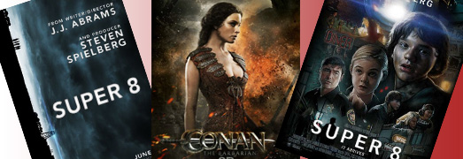
Super 8
The few posters that have been released for J.J. Abrams’ new summer blockbuster have really caught my eye. I’m a big fan of all three that have been released. Two of them have a distinct throwback personality to them. One has that old-school hand-drawn floating head structure like the original ‘Indiana Jones’ posters, while the other has a distinct ‘Close Encounters of the Third Kind’ feel. Finally, the one that’s been out forever is the vertical skyline image that reveals next to nothing about the movie other than that it has some mystery element. (Spoiler alert: Pay close attention to where the bright stream of light originates from.)


Conan the Barbarian
I know we have some huge ‘Conan’ fans out there, and these character action posters should get you excited for the new movie. Brute force, bulging pectorals, and bosomy babes… What more could you ask for?


Don’t Be Afraid of the Dark
I’m always on the look out for interesting and unusually creative movie posters. They make the best framing opportunities. This poster for Guillermo Del Toro’s new horror flick ‘Don’t Be Afraid of the Dark’ is simply awesome. You’ve got to love the artwork, the simplicity, and the sense of dread it portrays. Wonderful.


EM
I don’t care for the first Super 8 poster. I think it’s because the art style, realistic as it is, falls into the “uncanny valley” between realism and cartoonishness. The effect is a little creepy and odd, not in the good way that the movie is a little creepy and odd. 🙂
The style of the second poster pleases me, but I think the depiction deviates too much from the film.
I really dig the third poster. It’s appropriately mysterious. The sideways perspective is an goofy choice, but I like it—it’s what you might get from a camera dropped during a crisis, and it suggests that the world (or, at least, somebody’s world) will be turned on its ear.
William Henley
I am almost the complete opposite. The only thing I liked about the third poster was that it was sideways, which I felt to be quite creative (and if you have seen the movie, you know that it actually does have something to do with a scene from it).
The first poster, with its throwback look, sets the feel of when this movie takes place. It kind of gives you the impression of what to expect from this movie.
BTW, now that the movie has been out almost a week, I want to throw out something I noticed in the movie that almost ruined the time frame for me. Its subtle, but I saw it on a big enough screen that I noticed. On the television, when they are watching the news, they have a graphical channel logo on the picture, with some other text layed over a graphic. While character generators were around in 1979, a small town newschannel would not have one of that quality (shoot, even large towns wouldn’t). The graphical logo certainly would not have been on the screen.
EM
By the way, the “1979 vs. 1980” discussion below led me to recognize another anachronism in the film. There’s a reference to the Rubik’s Cube, which was not introduced in the United States until 1980—oops!
Aaron Peck
AuthorI really love the first ‘Super 8’ poster. Its nostalgic and has a totally 80s adventure movie feel to it. If it didn’t have the big white lettering at the top it’d be one I’d consider getting framed.
EM
That 1980s feel is part of the problem of the first poster, for me…since the movie is so firmly set in 1979. When I look at adventurish-movie posters of 1979 (1941, Alien, The Black Hole, The Black Stallion, Buck Rogers in the 25th Century, Dawn of the Dead, Monty Python’s Life of Brian, Mad Max, Moonraker, Phantasm, Star Trek: The Motion Picture, Time After Time—just to name a few), I don’t see any of this style.
Aaron Peck
AuthorIt’s kinda splitting hairs with ’79 vs. ’80. I’m not going to get too hung up on one year’s difference.
EM
They felt different to me.
Which 1980 film posters do you think the Super 8 poster resembles? I’m not seeing the floating-heads resemblance to Alligator, Battle Beyond the Stars, The Blues Brothers, The Blue Lagoon, Fade to Black, Flash Gordon or Star Wars: The Empire Strikes Back, for example.
EM
By the way, I agree that the Don’t Be Afraid of the Dark poster is very effective. If I judge purely from the poster (I don’t believe I’ve even heard of the movie before), it makes me want to see the movie.
Michael S. Palmer
I was just talking to my buddy who works at BAD ROBOT. Turns out that first SUPER 8 poster…the one that looks like all the classic Amblin / 80s posters…is actually, if I understood him correctly, fan made (not anything done by the studio / marketing).
William Henley
http://www.amazon.com/exec/obidos/ASIN/B0055ERHHA
Read Product description
thulsadoom
I really like the first Super 8 poster! There just aren’t enough traditional posters these days. The other two are just typical soulless ‘stylised’ photoshop jobs. Nothing wrong with them, but they’re nothing thrilling, either.
I think the painted poster (Digital or traditional?) is great, and my only minor complaint would be that it’s a tad too busy, but it’s still the best film poster out since the final ones Drew did for Indy IV. I can’t think of any ‘traditional’ posters since, till this one. Heck, I’d rank even an imperfect traditional poster over any photo comp, and this one’s pretty spot-on. 🙂
If it was fan made and then officially picked up by Abrams because he liked it so much, then good for him! 🙂