
Here at The Bonus View, we’d like to highlight the more artistic side of filmmaking. Yes, film is art, but we’re not talking about that. There’s an entire world of artful marketing going on with our favorite medium. Like movie posters (which we’ve already started a feature to highlight), Blu-ray cover art can run the gamut from poignant pieces that capture the true feeling of a film to cut-and-paste crap that simply makes us shudder at the prospect of putting it on our shelves. In our new “Uncovered” feature, we’ll take a look at recently released art for new discs coming out, discuss whether we love or hate it, and what it ultimately says about the movie inside the case. Hopefully, we’ll also be able to feature the artwork of some of our talented forum posters who think up and create their own cover art.
New Cover Art
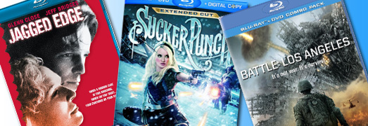
It was pointed out by forum member Krawk that the Blu-ray cover art for Zack Snyder’s ‘Sucker Punch’ looks radically different from the cover art that’s being provided for the DVD. To quote Krawk: “Why do they lame down the cover art for the Blu Ray versions so many times! The dvd cover looks much better.” If this is indeed the case, and the images provided on Amazon.com end up being the final artwork for the movie, then I’d have to agree.
The Blu-ray cover art is cartoony, while the DVD cover art seems like it gives you a better feel for what’s contained in the movie. Yes, I know that both covers are pretty corny (leather-clad babes looking hot and toting big guns), but the DVD art certainly outshines what was chosen for the Blu-ray. Even if the DVD cover art ends up being a filler image, and the studio just hasn’t posted the DVD’s real artwork yet, I still have to ask why they didn’t go with that image over the one chosen for the Blu-ray?
 Blu-ray Cover Art
 DVD Cover Art
This is actually one of my favorite pieces of cover art in the bunch. It’s nice because ‘Battle: Los Angeles’ could have easily gone with some floating heads of all the Marines, and some alien spaceships crashing in the background. This gives us one faceless Marine as he stares down a towering spacecraft. I could have done without the wording that cuts across the middle of the image, but I like the idea that it’s going for. It gives that ominous feeling that many of the posters for the movie provided.

Matthew McConaughey, fully clothed? Have I entered an alternate dimension? Or has McConaughey finally grown up? I didn’t see ‘The Lincoln Lawyer’ in theaters, but heard good things about it. This artwork is pretty bland, though. It goes for the oh-so-gritty look by adding grit-filled filters in Photoshop, but it just comes across as trying too hard.

Worst Cover Art of the Week
I just received my review screener for the Jeff Bridges thriller ‘Jagged Edge’ in the mail yesterday. After taking it out, I was struck by the sheer ugliness of its cover art. I couldn’t believe that something like this got past everyone and ended up being printed. Just look at it. Those cut-and-pasted faces of Glenn Close and Jeff Bridges are downright atrocious. Bridges looks like Sloth from ‘The Goonies’. It’s like someone did a hatchet job with the magnetic lasso in Photoshop. I have a hard time believing this was the best they could come up with. I’m no Photoshop whiz, but I think that even I could make something in ten minutes that would look 100 times better than this. It’s simply dreadful.

Custom Cover Art
Finally, I wanted to take a moment to highlight one of my favorite recent additions to the Custom Blu-ray Covers thread in the High-Def Digest Forums. Member David Susilo created a custom cover for the ‘Back to the Future Trilogy’ that I really like. The absolute best part of this cover is the inclusion of the time codes from the time machine’s dashboard. It’s a great addition for fans. Way to go, David!


William Henley
That custom cover for Back To The Future is AWESOME!
BTW, as bad as the cover art of Sucker Punch is, I think it describes the movie pretty well. 🙂
For Jagged Edge, it looks like someone who didn’t see the movie (well, I haven’t either) just looked at the cast and the name of the movie, did that hack job, and sold it to their manager as “Jagged Edge, see? So I did a crap magic-lasso in Photoshop to create this effect. Jagged Edge, get it?”
Dail Whiteley
that has been the cover art since the day of video. back then it was a white back ground now it’s red . the red doesn’t work.
Dail Whiteley
btw i was talking about the jagged edge cover art.
Aaron Peck
AuthorIf there was ever a time to update, now would have been it. It’s just so ugly. Crazy thing is there are a couple much better, more detailed pictures of the two stars on the back of the case that would’ve been far more suited to be cover art pictures.
Luke Hickman
I *would* love the cover art for Battle L.A. if it was so spoilerific as to show the climax of the ending. I had the same problem with the last trailer. SPOILER ALERT! It showed this huge ship come up from the ground, when they *think* they destroy the antenna in the end, the audience already knows it’s going to rise and cause problems.
I’m ok with Sucker Punch and Lincoln Lawyer. Surprising, the Lincoln Lawyer cover is nothing more than the one-sheet that was hanging at your local cinema.
But the gold goes to the Back to the Future cover. Honestly, I prefer David’s cover art over the one I actually own!
Aaron Peck
AuthorThing is you wouldn’t know that the cover for ‘Battle: LA’ is a spoiler unless you’ve seen the movie. So now you just ruined it for everyone else who hasn’t seen it.
Ha ha. 😉
Gareth Callenby
They both have. Trailers should never show scenes from the last act of the film. Familiar with the trailer of a movie I’m watching, I might think, “Well I know he’s not really dead because that scene where he’s throwing the ax straight at the camera hasn’t happened yet.”
Dennis Lafontaine
Krawk here – The dvd cover for Sucker Punch is presented as the theatrical movie poster.
The same EXACT problem is with the Red Riding Hood cover. Dvd version – movie poster, blu ray cover, lame.
Michael S. Palmer
Great work, David!
@ Luke. Totally agree re: the spoiler nature of the billboards, posters, and now BD cover art. I HATE it when marketing department use imagery from the last half or third of movies.
I know MEGAMIND wasn’t exactly a big hit, and the BD has some PQ issues, but one of the funnest parts about seeing it theatrically was that all the trailers were about the film’s first act. The actual story was a surprise.
Luke Hickman
It’s nice when a film’s story is kept surprise. My favorite example of that is ‘District 9.’ Based on the trailers alone, the movie looked like a faux documentary. You had no idea where it was going after the first fifteen minutes. You saw him get sprayed in the face and that was it. Yes, they showed little snippets of action from throughout, but nothing that ever alluded to the film’s crazy story and plot! That is what I’m loving about ‘Super 8’ too. JJ Abrams is the modern king of truly “teasing” the audience.
EM
Now if only he would work on the delivery phase.
Julian
On a quite related topic : why does Disney always tinker with the covers of its home video releases? The Blu-ray covers for Snow White, Beauty and the Beast are pretty mediocre … they should just opt for the original poster design instead.
Although, I must say … their Aladdin CAV LaserDisc IS different from the poster — and with stunning results. It’s my favourite Disney cover.
EM
I generally prefer front-cover art that’s strongly based on the original posters, too. But since some original posters are lousy, I’m willing to make exceptions. 🙂
On the subject of unwelcome spoilers on home-video covers, one film that comes to mind is Gremlins: various releases have shown the gremlins and/or mogwai very explicitly. I feel that first-time viewers should experience the film, as much as possible, with the same surprise the original audiences did.
Chad Lawless
That’d be a great “Round-table” discussion, wouldn’t it? What Blu-Rays have better art than their original posters (or vice-versa)?
Chad Lawless
Thanks for introducing me to the Custom Blu-Ray Cases! Are they available for download, or do you just need to email the individual?
I was just thinking the other day how once I get ahold of my old DVD collection (in storage back in Savannah, GA… I now live in San Jose, CA) I’ll be adding the Akira Blu-Ray into the “old” Akira DVD tin. And once the Lord Of The Rings Trilogy Blu-Ray shows up, I’ll transfer THOSE into the “book-style” Extended Edition DVD cases.
Anyone else doing that with their collection?
I guess I’m just disappointed with some of the Blu-Ray DVD packaging that’s coming out…
Tim Tringle
Aaron,
Actually the Jagged Edge artwork isn’t a photoshop other than the color red. The actual faces of Jeff Bridges and Glenn Close on that cover are pulled directly from the original theatrical poster. Here’s a link to the poster to compare to.
http://cf1.imgobject.com/posters/56c/4d5efb575e73d6310500056c/jagged-edge-original.jpg
I for one almost universally hate what has become of DVD (originally) and Blu-Ray covers. Especially with classic or back catalog films. I despise most of the photoshop disasters that come from this new medium because the only reason most of them look the way they do is due to the greed of the studios involved who don’t want to part with the money for the release rights to the original poster artwork for the movies in question. I always prefer the original artwork to these cheesy ripoffs especially when it comes to movies that came out while these new mediums exist. How do they not get the rights to modern movie posters.
Take the blu-ray release of Spielberg’s War of the Worlds. Everybody who’s ever seen or heard about that movie already knows that Tom Cruise is in the movie. Why do we need some reject from a photoshop class plastering his face when his name is gonna be on the cover as well? I just don’t see why the original poster artwork is ok for the theater but not for DVD or Blu?
And when someone thinks that a screwed up photoshop is better than the posters for things like the original “Taking of Pehlam 123”, they are nuts.
Compared to any of the original posters that is just crap. Have a look at what should have really been on the DVD.
Take your pick they are all better than what MGM picked for the DVD.
Look at whats available at http://www.themoviedb.org/movie/8333/posters You’ll see not one example of bad DVD covers but two. They actually rereleased it twice on DVD and didn’t choose the original poster or any of the better ones they could have.